 01 · Foundation
 A working design system for the Nourish website — rooted in the logo’s teal-green core, extended with warm accents, and committed to art over information.
Our mission is food system literacy, but our medium is design. Nourish should radiate the artistic quality of a magazine cover, a poster show, or a beautifully printed cookbook — never a school worksheet or an institutional explainer. Every page should feel like something a designer would screenshot.
Italic Playfair Display headlines. Generous white space. Beautiful photography that earns its real estate. Quiet sans-serif body type that lets the imagery breathe. Sophisticated, optimistic, slightly literary.
No tag-cloud sidebars. No multi-colored CTAs competing for attention. No stock-feel clipart of fruit baskets or smiling families pointing at things. No "Learn More!" buttons that shout. Information density elevated by editorial restraint.
Five core colors carry the brand. Three warm accents solve light-green legibility on white. Soil replaces black for body type. The orange burst variant unlocks Harvest and Ember as authentic brand voices, not just accents.
The serif carries emotion. The sans carries information.
“Soil isn’t the bottom of the food system — it’s the beginning of every meal we eat.”
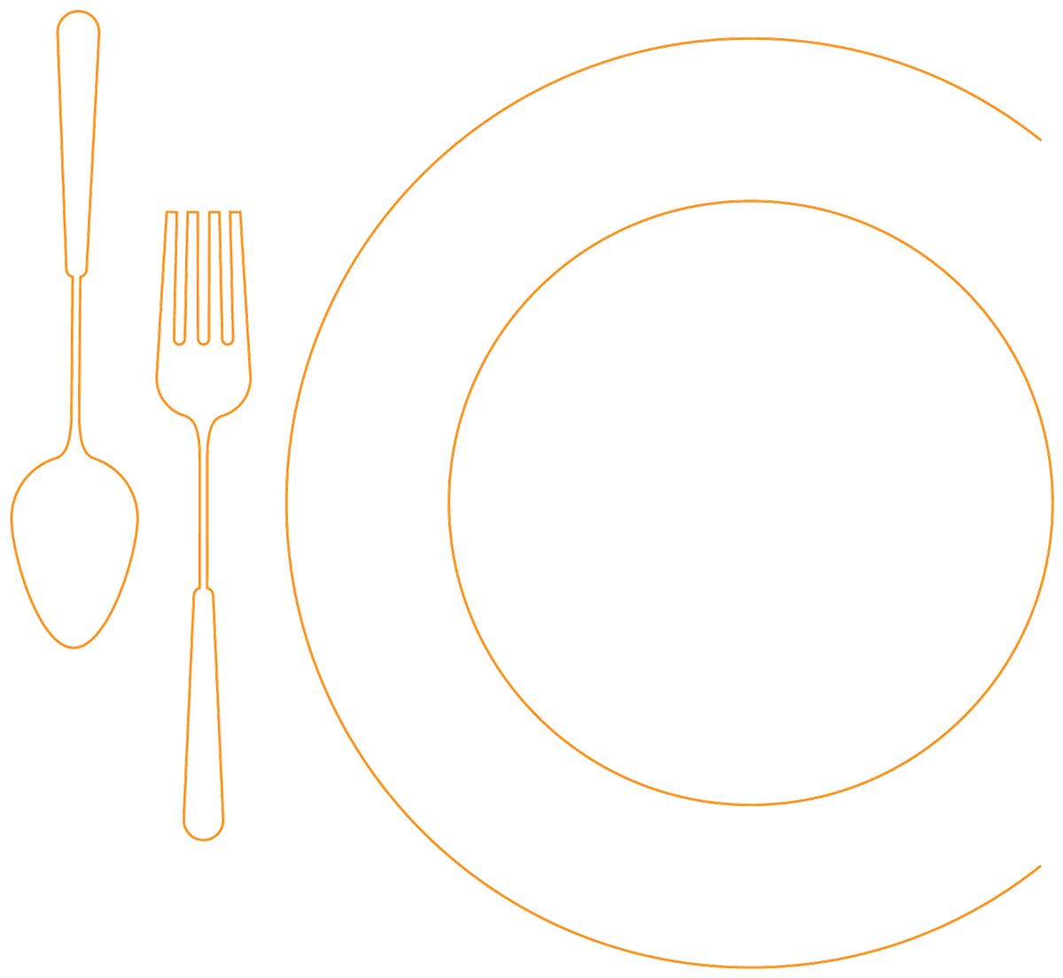
The horizontal lockup is the everyday workhorse. The burst-over-i is reserved for large-format and signature brand moments. The standalone burst is a versatile graphic element.

Approved color variants of the standalone burst. The orange/red palette unlocks Harvest and Ember as legitimate brand voices — useful for warm contexts, summer campaigns, or any moment that wants energy more than calm.
Greens · default  Harvest gradient
  White · on Soil White · on Fern
 + Default to the horizontal lockup for headers, footers, signatures.
+ Use the burst-over-i for large-format prints, posters, hero moments.
+ Reverse to white on Fern, Soil, or rich photography.
+ Keep clear space equal to the height of the burst all the way around.
− Stack the burst on top of the wordmark vertically — legacy treatment only.
− Recolor the wordmark to anything other than Fern, Soil, or white.
− Place the logo on a photo without sufficient contrast or scrim.
− Add a tagline outside of the "food + community" signature lockup.
Four modes carry the brand. Diversity of people and places is non-negotiable. Photography earns its size — never cropped just to fill a grid cell.
Both, deliberately. Each choice carries an emotional register.
Editorial. Architectural. Magazine. Use for photos, hero panels, story cards in the main editorial grid. Conveys seriousness, restraint, art-direction. This is the default for the website’s editorial body.
Welcoming. Approachable. Hand-touched. Use for badges, pill filters, avatar circles, and curriculum contexts where students and educators land. Rounded type-and-color combinations signal "this is for you."
Instead of a separate ornament system, Nourish riffs on its own logo. The burst gets blown up large, reversed out, broken into single petals, or used as a photographic mask. The brand becomes its own decoration — coherent, unmistakable.
The burst is powerful precisely because it’s scarce. Each layout module gets to choose one burst riff — oversized watermark, single petal, reversed-on-Soil, or photographic mask. Stack more than one and the page stops being a magazine and becomes a moodboard.
Fern band, watermark in the corner. The most common riff.
Single petal between editorial blocks. Replaces the old leaf-SVG accents.
Reversed burst on Soil for closing CTAs, newsletter moments, footers.
Hero photos already doing emotional work. Photography wins.
For utility we draw on Google’s Material Symbols — clean, dependable, universal. For warmth and personality we use the custom hand-drawn illustrations developed across previous Nourish work.
Used for UI affordances: navigation, search, share, bookmark, filter, video play. Outlined weight at 32–40px. Colored using the palette — never default gray.
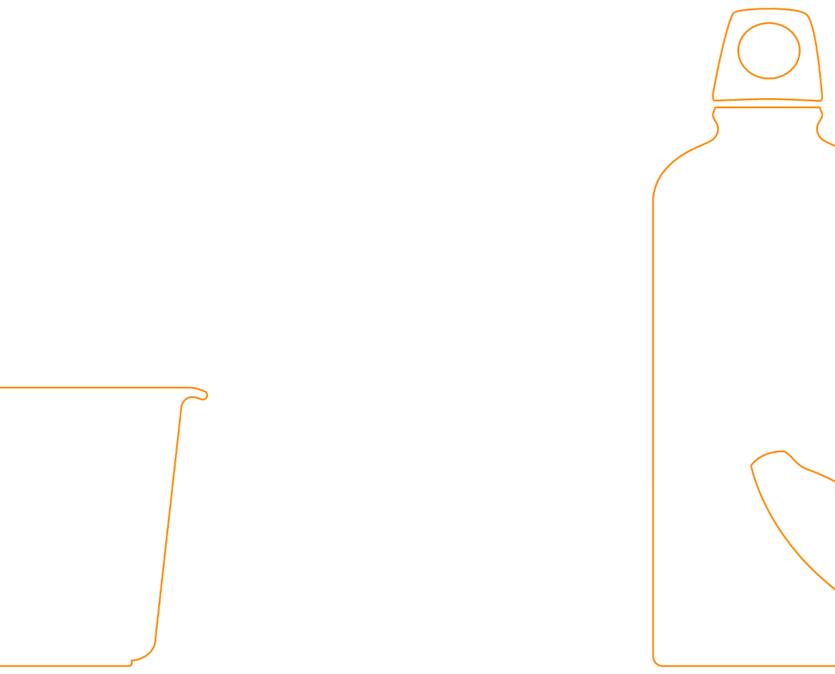
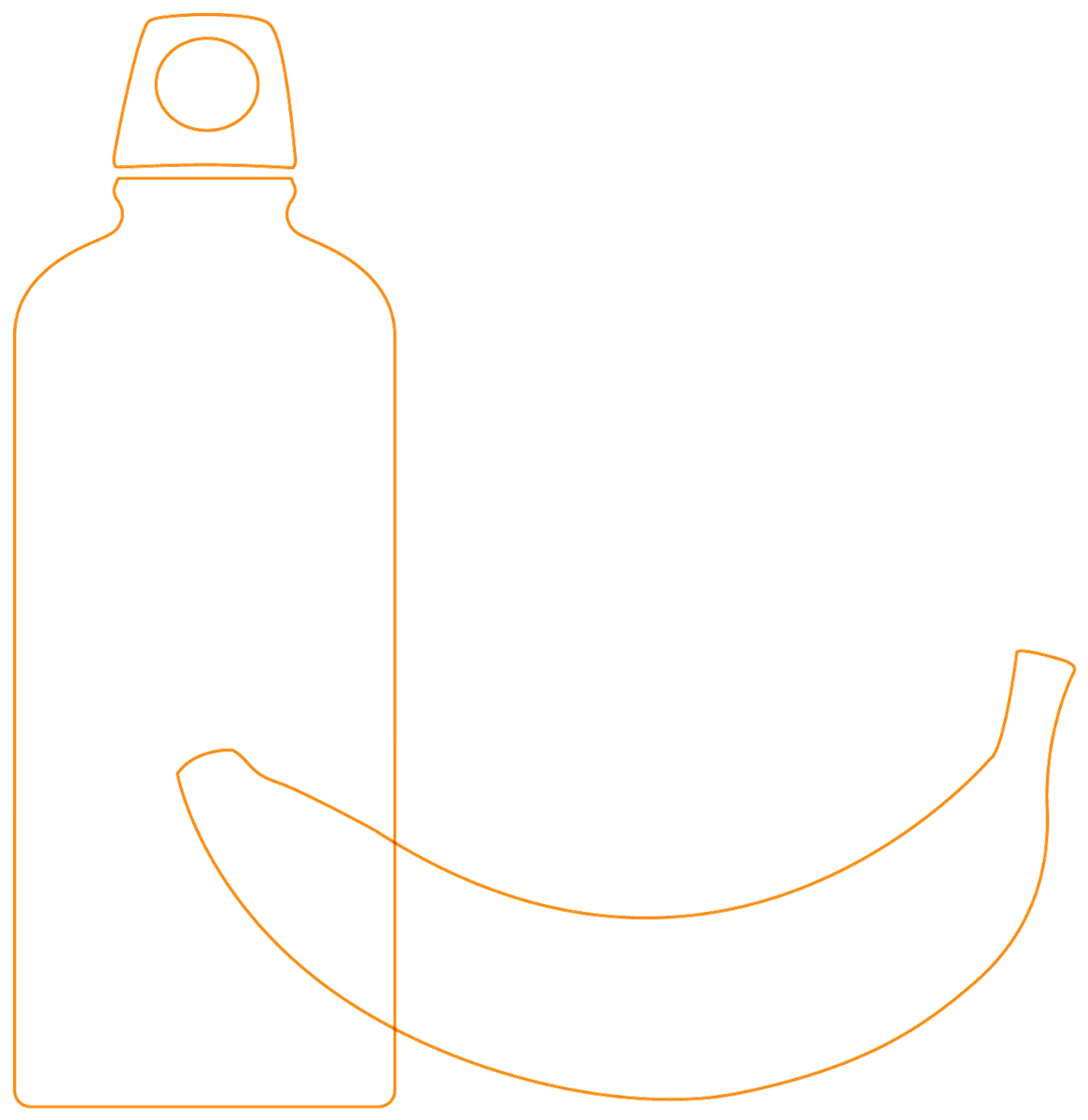
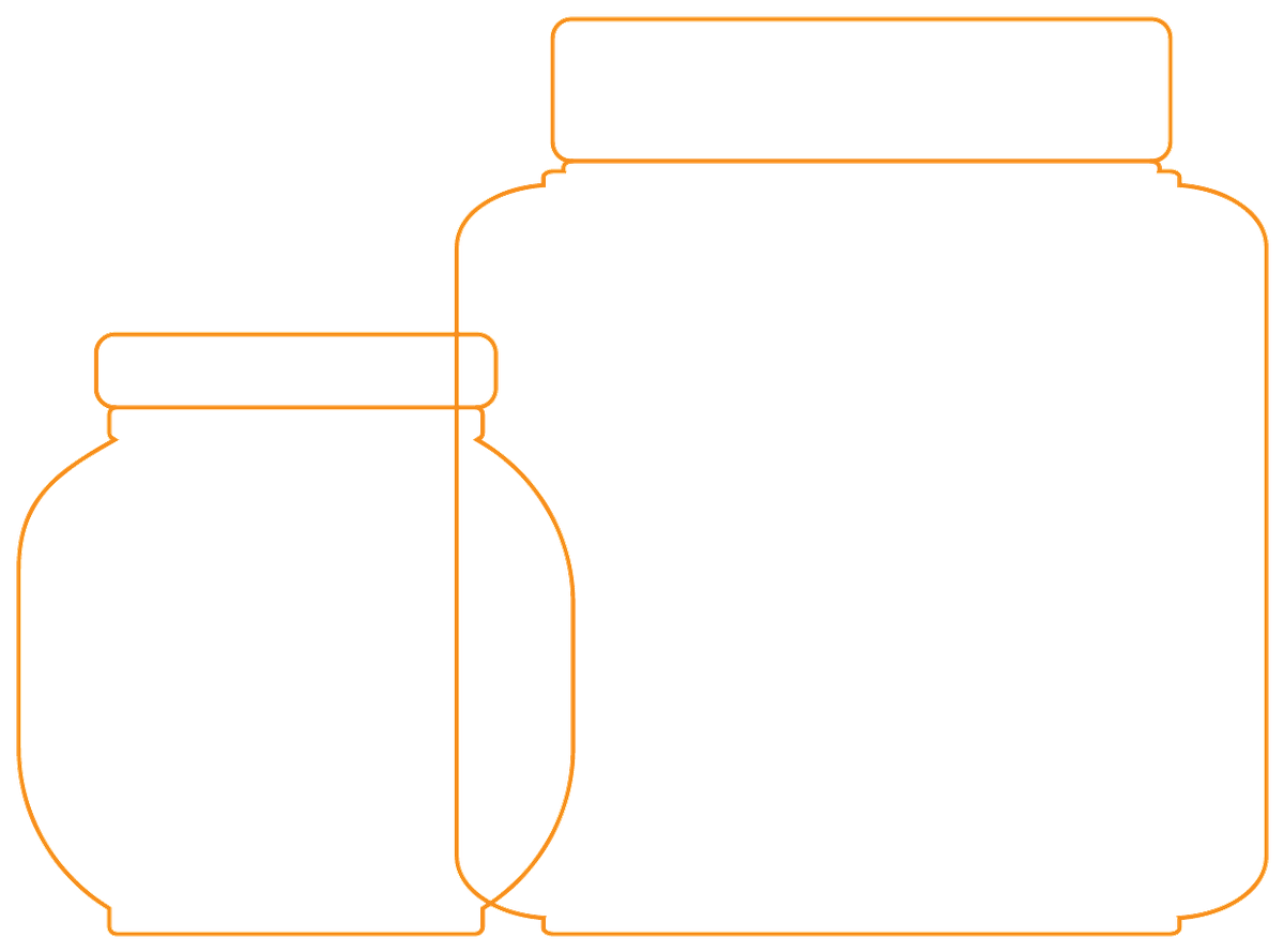
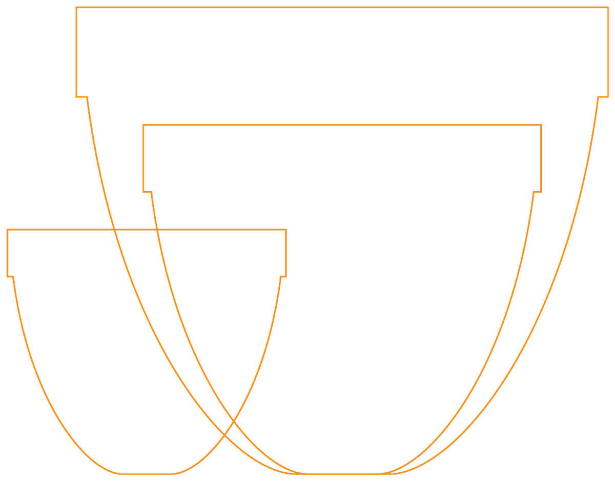
The orange-line illustrations from the Family Kit project. Used for educator content, recipe ephemera, classroom kits, and any moment where the brand wants to feel handmade rather than corporate.
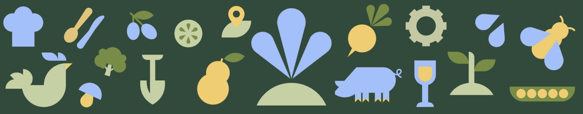
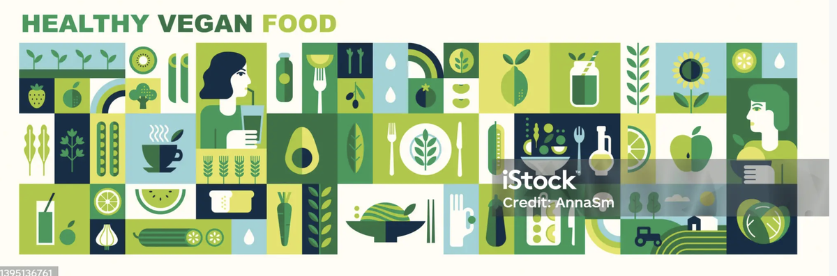
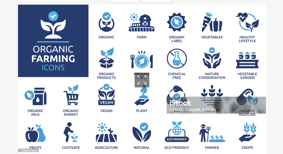
In addition to Google Material Symbols (for UI utility) and the Family Kit illustrations (for personality), Nourish is evaluating these supplementary icon sets to extend the visual vocabulary for food, farming, and classroom content. Watermarked previews shown — full sets pending license.
Geometric flat-color illustrations on dark backgrounds. Strong personality, instantly recognizable. Best for: campaigns, posters, social, hero moments where the brand wants energy.
Tile-grid composition of green/yellow flat-color food icons. Best for header strips, footer ornaments, editorial-section openers.
Two-color (blue + cream) circular icons in a structured grid. Best for educator/curriculum materials, certification-style badges, K-12 lesson covers.
Black silhouette set: seeds, tractor, animals, crops, tools. Best for inline UI accents, lesson-card thumbnail keys, info-graphic legends. Stylistically consistent with Material Symbols.
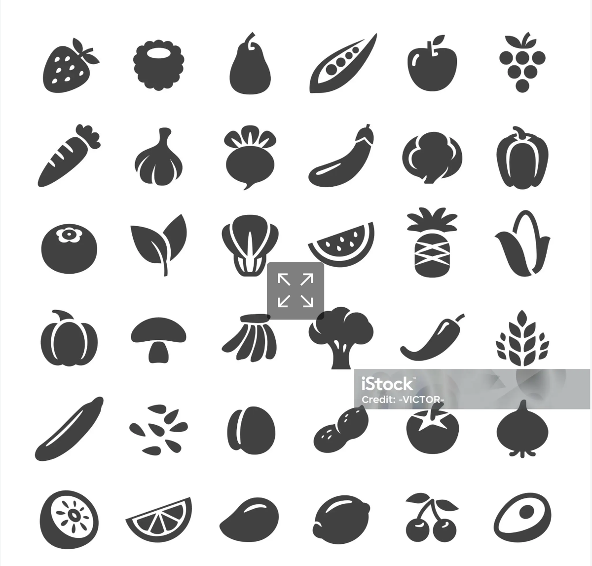
30+ produce silhouettes — apples, berries, brassicas, melons, citrus. Best for lesson tags ("Seasonal, Local Food"), recipe-related content, ingredient labels.
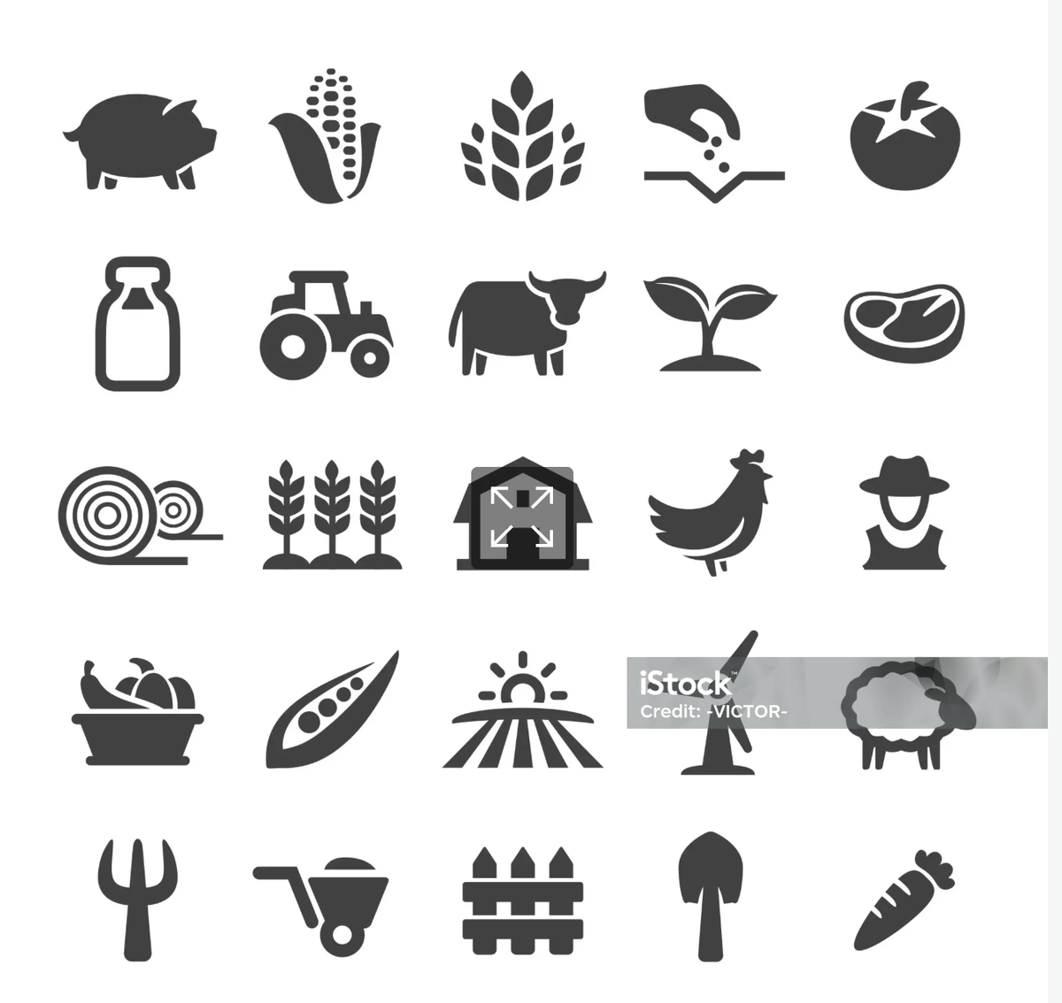
Pitchfork, wheelbarrow, fence, shovel, carrot; pig, cow, chicken, sheep; barn, milk-jug, hay-bale. Best for curriculum spreads and animated-lesson primers.
The brand can comfortably hold two supplementary sets: one flat-color set (Candidate A or B) for personality moments and editorial flourishes; one monochrome silhouette set (D, E, or F) for utility/UI accents that don't compete with photography. Three sets risks visual chaos. The duotone "Organic Farming" set (C) sits between modes and may not be necessary if we have one of each.
Nourish is the magazine the food movement wishes it had — photographic, optimistic, deeply reported. Information delivered with such craft that the design itself argues for the work.